Box Plot vs. Histogram: Unraveling the Differences
When it comes to representing data graphically, box plots and histograms are two popular choices. Both are used to summarize and display data, but they are quite different in terms of their approach and the information they convey.
Here, we'll explore the difference between a box plot and a histogram:
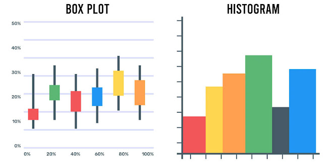
First, let's define what each of these graphs is. A histogram is a graphical representation of data that displays the frequency of numerical data in different intervals or bins. The bars in a histogram represent the number of observations falling into each bin.
On the other hand, a box plot, also called a box and whisker plot, is a way of displaying the distribution of a dataset using the five-number summary: the minimum value, the first quartile, the median, the third quartile, and the maximum value.

One of the most significant differences between a box plot and a histogram is how they display the data. A histogram is a bar graph, where the height of each bar represents the frequency or count of data points falling within a certain range. In contrast, a box plot is a schematic that shows the range, median, quartiles, and outliers of a dataset.
Another difference between a box plot and a histogram is the type of data they are suitable for. Histograms are commonly used to display continuous data, such as weight, height, and temperature, and discrete data, such as counts and scores.
Box plots are more suitable for displaying the spread and central tendency of continuous data and comparing it across different categories or groups.
In terms of the information conveyed, a histogram provides an overview of the distribution of the data and the frequency of the observations. It can show whether the data is normally distributed, skewed to the left or right, or bimodal.
A box plot provides more detailed information, showing not only the central tendency and the spread of the data but also the outliers and the skewness of the distribution.
The interpretation of a histogram and a box plot is different. A histogram is interpreted by observing the shape of the distribution, such as whether it is symmetric or skewed, and the position of the center of the distribution, which is represented by the peak of the histogram.
On the other hand, a box plot is interpreted by analyzing the position of the whiskers, the length of the box, and the presence of outliers. A box plot also provides information on the quartiles, which indicate the spread of the data, and the median, which represents the central tendency of the data.

Box Plot and Histogram in Statistics
In the field of statistics, both box plots and histograms are valuable tools used to visualize and analyze data.
A histogram is a graphical representation that displays the distribution of a dataset by dividing it into bins or intervals and counting the number of data points falling into each bin. It provides insights into data patterns, including the shape of the distribution, central tendencies, and outliers. Histograms are particularly useful for understanding the frequency and density of data points within various ranges.
On the other hand, a box plot, also known as a box-and-whisker plot, presents a summary of the data's distribution, including its median, quartiles, and potential outliers. It offers a concise way to visualize the spread and central tendencies of data, making it easier to compare multiple datasets or identify variations within a single dataset.
Both these visualization techniques have their unique advantages, and choosing between them depends on the specific data and the insights you seek. Histograms provide a detailed view of data distribution, while box plots offer a compact summary, making them complementary tools for statisticians and data analysts.
Interpreting Data with Box Plots and Histograms
Histograms offer a visual representation of data distribution by creating bins or intervals and displaying the frequency of data points within each bin. This allows analysts to identify patterns, central tendencies, and potential outliers in the dataset quickly.
Box plots, also known as box-and-whisker plots, provide a concise summary of data distribution. They reveal essential statistics such as the median, quartiles, and the presence of outliers. This visualization method aids in comparing datasets or understanding variations within a single dataset.
When interpreting data, the choice between these tools depends on the level of detail required. Histograms provide a more granular view of the data, while box plots offer a high-level summary. Together, they form a powerful duo for extracting meaningful insights from data, making them indispensable in the field of statistics.

Summarizing:
While both box plots and histograms are used to represent data graphically, they differ in their approach, suitability, and information conveyed. A histogram displays the frequency of data within certain ranges, while a box plot shows the distribution of the data using the five-number summary.
A histogram is suitable for continuous and discrete data, while a box plot is best for comparing data across categories or groups. While a histogram is interpreted by analyzing the shape of the distribution, a box plot is interpreted by examining the position of the whiskers, the length of the box, and the presence of outliers.